

About this study
We compared some popular component libraries that comes with very different messages: Semantic for being the “mature guy in the room”, MUI for customisability and community support, and finally, IBM’s Carbon Design for accessibility. We tested all of them and compared them head-to-head for your reading pleasure 😀
Of course, since we are an accessibility company, our tests and evaluation method is purely from an accessibility standpoint. We hope you enjoy and benefit from this work.
Component libraries included in the study
Definition: Accessibility ranking
Components are compared to each other and ranked amongst themselves based on their accessibility test findings.
Overall results and accessibility rankings
| Component | Semantic UI | MUI | Carbon Design |
|---|---|---|---|
| Input | 3 | 2 | 1 |
| Input with accessory | 2 | 1 | N/A |
| Textarea | 3 | 2 | 1 |
| Date picker | N/A | 1 | 2 |
| Dropdown | 2 | 3 | 1 |
| Slider | N/A | 2 | 1 |
| Radio Group | 3 | 2 | 1 |
| Checkbox Group | 2 | 3 | 1 |
| Button | 3 | 2 | 1 |
| Button with icon | 3 | 2 | 1 |
| File uploader | N/A | N/A | 1 |
| Modal | 2 | 3 | 1 |
| Accordion | 3 | 2 | 1 |
| Chip | 1 | 3 | 2 |
| Wizard | 3 | 1 | 2 |
| Toggletip | N/A | 2 | 1 |
| Tooltip | 3 | 2 | 1 |
| Tab Group | 3 | 1 | 2 |
| Total 1st rankings | 1 | 4 | 13 |
| Total 2nd rankings | 4 | 9 | 4 |
Summary
| Component library | Semantic UI | MUI | Carbon Design |
|---|---|---|---|
| Generic | Semantic UI components are old-school, and accessibility is poor on many components. |
Material Design look is appealing, especially since Flutter is used in app development. Although Material Design look gets more recognized every day, it still confuses iOS, iPadOS and macOS users who expect to see native-looking UI components. |
Carbon uses a non-conventional grid system called 2x. It is different than 12 column grids which mainstream UI frameworks use. This brings new possibilities but also limitations on how UI can be designed. Carbon has a strong focus, test procedures and roadmap for accessibility. |
| Maintainability | Semantic UI has a comprehensive documentation for development. Developer API is simple to use and there is a large collection of components. |
MUI has a comprehensive documentation and a toolset for development. There is a large collection of components. |
Carbon is promising but immature from a developer’s perspective.
Version 11 was recently released with breaking changes, and it is still under development (they release Documentation for this version is partially incomplete/outdated. There are no type definitions for the latest version, which makes it difficult to develop if you are |
| Support | There are 326 contributors for the project at GitHub. | MUI has a paid premium support plan. | It is supported by IBM, usually you get a response for GitHub issues in hours. There are 347 contributors in GitHub. |
| Community | There are 2,734 questions on Stack Overflow. 64% of them has an accepted answer. |
There are 19,815 questions on Stack Overflow. 60% of them has an accepted answer. |
Carbon is not a popular framework. There are only 48 questions asked on Stack Overflow and only a few of them has an answer. |
Accessibility test results by component
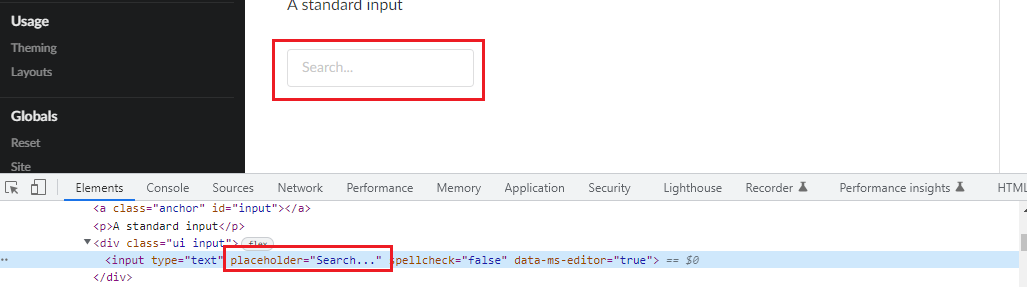
Input
Inputs enables users to enter free-form text data.
| Semantic UI | MUI | Carbon Design | |
|---|---|---|---|
| Component | Input |
BasicTextField |
TextInput |
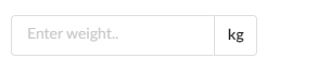
| Appearance | 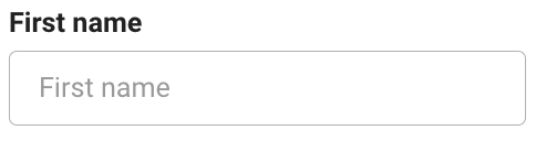 |
 |
 |
| Accessibility Findings | INPSEUI-1 INPSEUI-2 INPSEUI-3 | INPMUI-1 | INPCADE-1 INPCADE-2 |
| Accessibility Ranking | 3 | 2 | 1 |
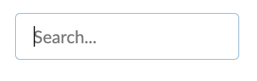
Input with accessory
Inputs with accessory indicate what type of data is expected from the user.
| Semantic UI | MUI | Carbon Design | |
|---|---|---|---|
| Component | Input |
Input Adornments |
N/A |
| Appearance | 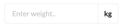 |
 |
N/A |
| Accessibility Findings | INPESEUI-1INPESEUI-2INPESEUI-3INPESEUI-4 | INPEMUI-1INPEMUI-2 | N/A |
| Accessibility Ranking | 2 | 1 | N/A |
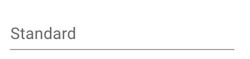
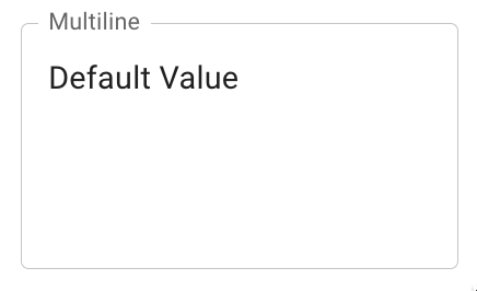
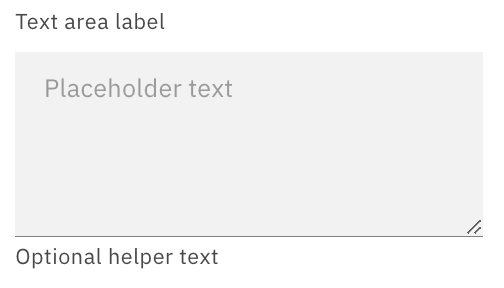
Textarea
Textarea enables users to enter free-form text data,usually for longer texts.
| Semantic UI | MUI | Carbon Design | |
|---|---|---|---|
| Component | Text Area |
Multiline |
Text area |
| Appearance | 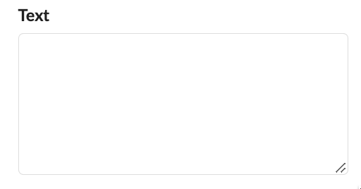 |
 |
 |
| Accessibility Findings | TEXSEUI-1TEXSEUI-2TEXSEUI-3 | TEXMUI-1 | TEXCADE-1TEXCADE-2 |
| Accessibility Ranking | 3 | 2 | 1 |
Date Picker
Date picker allows users to select a date.
| Semantic UI | MUI | Carbon Design | |
|---|---|---|---|
| Component | N/A | Date Picker |
Date Picker |
| Appearance | N/A | 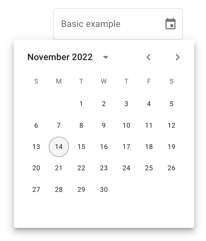 |
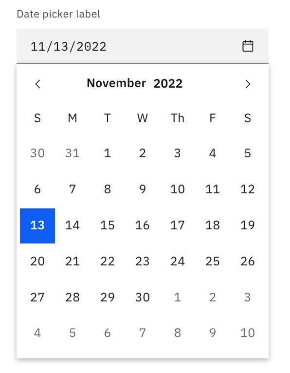 |
| Accessibility Findings | N/A | DATMUI-1 | DATCADE-1 DATCADE-2 DATCADE-3 |
| Accessibility Ranking | N/A | 1 | 2 |
Dropdown
Dropdowns present a list of options from which a user can select.
| Semantic UI | MUI | Carbon Design | |
|---|---|---|---|
| Component | Dropdown |
Select |
Dropdown |
| Appearance | 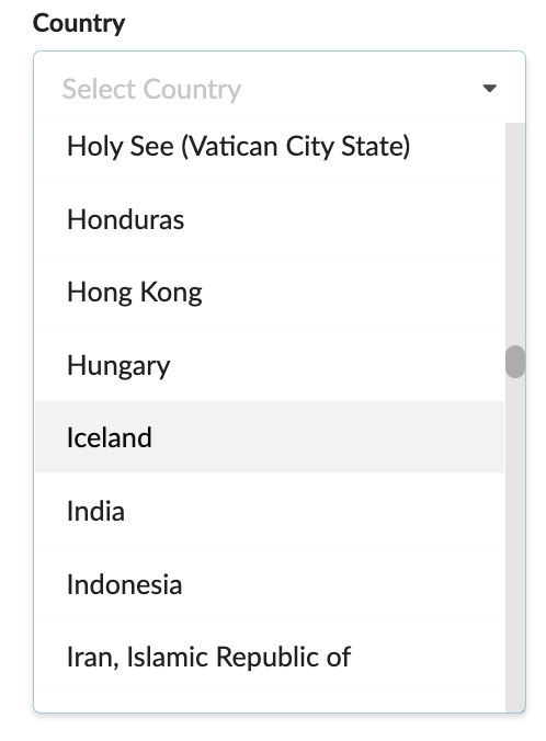 |
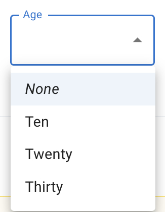 |
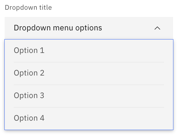 |
| Accessibility Findings | DROSEUI-1 | DROMUI-1 DROMUI-2 DROMUI-3 DROMUI-4 | DROCADE-1 |
| Accessibility Ranking | 2 | 3 | 1 |
Slider
Slider provides a visual indication of adjustable content, where the user can increase or decrease the value by moving the handle along a horizontal track.
| Semantic UI | MUI | Carbon Design | |
|---|---|---|---|
| Component | N/A | Slider |
Slider |
| Appearance | N/A | 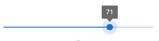 |
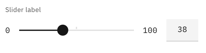 |
| Accessibility Findings | N/A | SLIMUI-1 | SLICADE-1 |
| Accessibility Ranking | N/A | 2 | 1 |
Radio Group
Radio group presents a list of options where only one value from the list is allowed to be selected at any time.
| Semantic UI | MUI | Carbon Design | |
|---|---|---|---|
| Component | Radio Checkbox |
Radio Group |
Radio Button |
| Appearance | 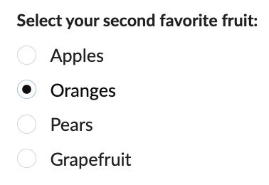 |
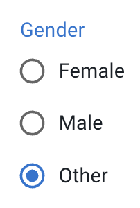 |
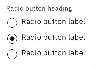 |
| Accessibility Findings | RADSEUI-1 RADSEUI-2 RADSEUI-3 | No issues are observed | No issues are observed |
| Accessibility Ranking | 3 | 2 | 1 |
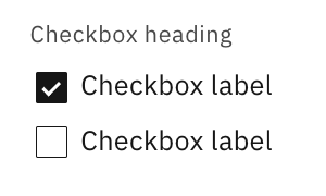
Checkbox Group
Checkbox group presents a list of options where any number of values can be selected. Zero, one or all possible values and anything in between.
| Semantic UI | MUI | Carbon Design | |
|---|---|---|---|
| Component | Checkbox |
FormGroup |
Checkbox |
| Appearance | 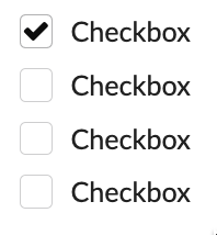 |
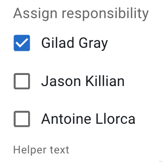 |
 |
| Accessibility Findings | No issues are observed | CHEMUI-1 | No issues are observed |
| Accessibility Ranking | 2 | 3 | 1 |
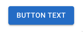
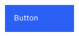
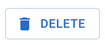
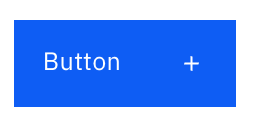
Button
Buttons are used to initialize an action. Button labels express what action will occur when the user interacts with it.
| Semantic UI | MUI | Carbon Design | |
|---|---|---|---|
| Component | Button |
Basic Button |
Button |
| Appearance |  |
 |
 |
| Accessibility Findings | BUTSEUI-1 | BUTMUI-1 | No issues are observed |
| Accessibility Ranking | 3 | 2 | 1 |
Button with icon
Buttons are used to initialize an action. Button labels and icon express what action will occur when the user interacts with it.
| Semantic UI | MUI | Carbon Design | |
|---|---|---|---|
| Component | Button (Basic) |
Buttons with icons and label |
Button |
| Appearance | 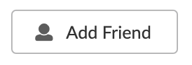 |
 |
 |
| Accessibility Findings | BUTISEUI-1 | BUTIMUI-1 | No issues are observed |
| Accessibility Ranking | 3 | 2 | 1 |
File uploader
File uploaders allow users to select one or more files to upload to the website/app.
| Semantic UI | MUI | Carbon Design | |
|---|---|---|---|
| Component | N/A | N/A | File uploader |
| Appearance | N/A | N/A | 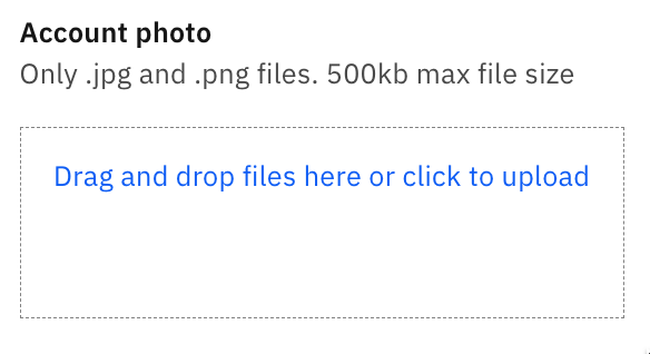 |
| Accessibility Findings | N/A | N/A | FILCADE-1 |
| Accessibility Ranking | N/A | N/A | 1 |
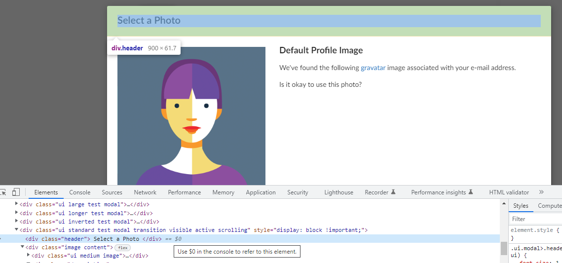
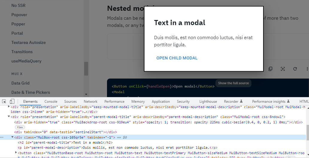
Modal
Modals focuses the user’s attention exclusively on one task or piece of information via a window that sits on top of the page content.
| Semantic UI | MUI | Carbon Design | |
|---|---|---|---|
| Component | Modal |
Modal |
Modal |
| Appearance | 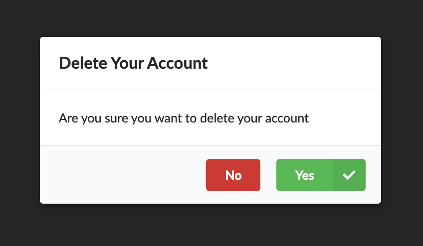 |
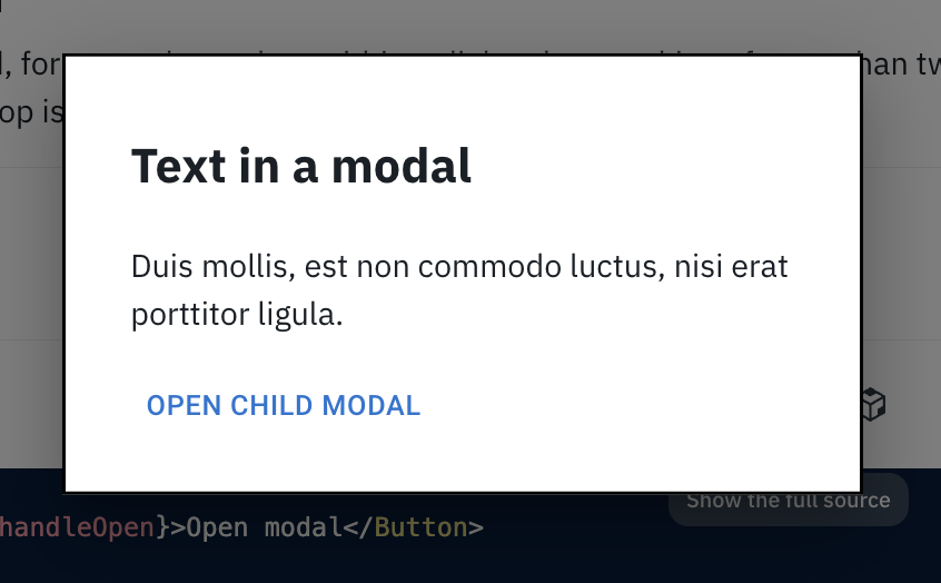 |
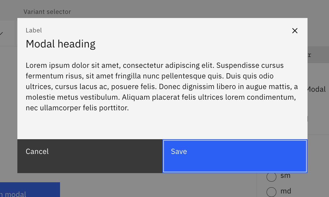 |
| Accessibility Findings | MODSEUI-1 MODSEUI-2 MODESUI-3 | MODMUI-1 | No issues are observed |
| Accessibility Ranking | 2 | 3 | 1 |
Accordion
An accordion is a vertically stacked list of headers that reveal or hide associated sections of content.
| Semantic UI | MUI | Carbon Design | |
|---|---|---|---|
| Component | Accordion |
Accordion |
Accordion |
| Appearance | 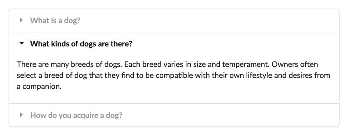 |
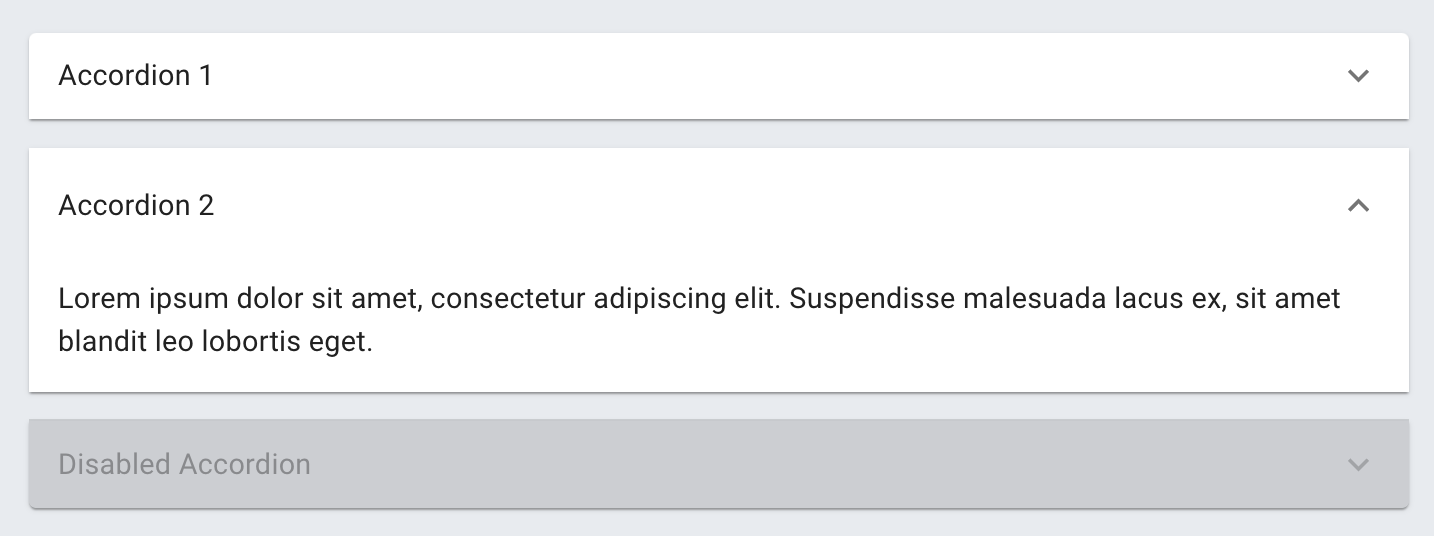 |
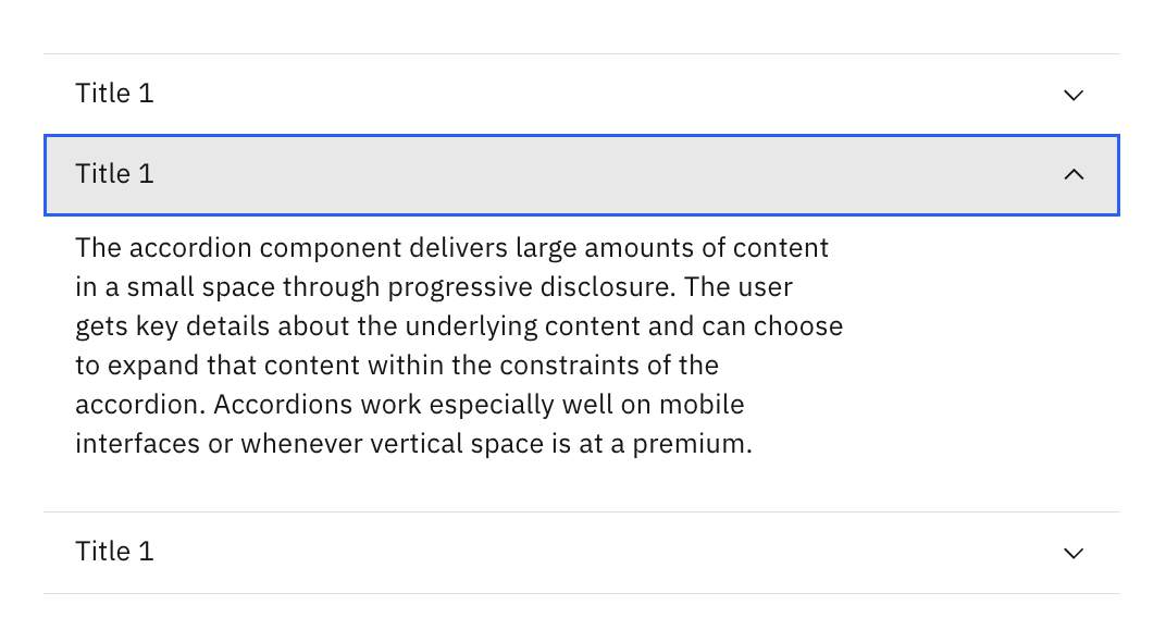 |
| Accessibility Findings | ACCSEUI-1 | ACCMUI-1 | No issues are observed |
| Accessibility Ranking | 3 | 2 | 1 |
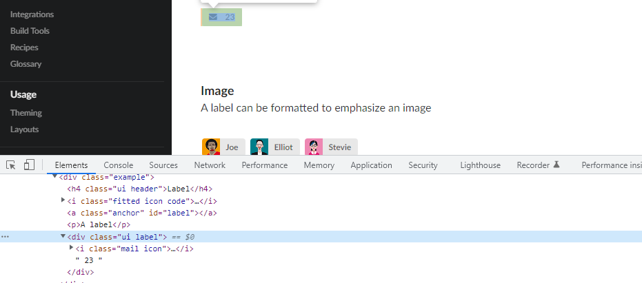
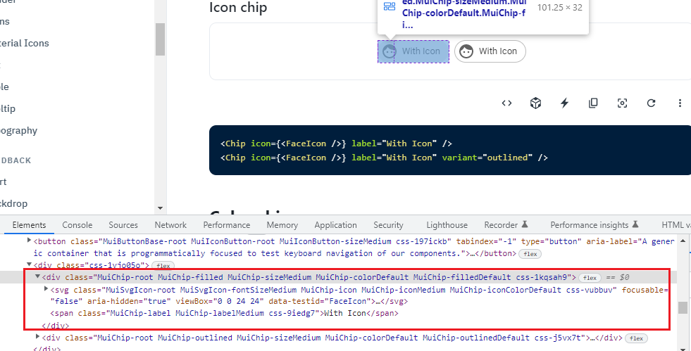
Chip
Chips are used to label, categorize, or organize items using keywords that describe them.
| Semantic UI | MUI | Carbon Design | |
|---|---|---|---|
| Component | Label |
Chip |
Tag |
| Appearance | 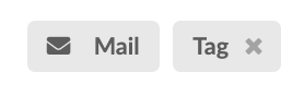 |
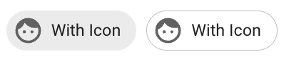 |
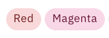 |
| Accessibility Findings | CHISEUI-1 | CHIMUI-1 | No issues are observed |
| Accessibility Ranking | 1 | 3 | 2 |
Wizard
A wizard is a visual representation of a user’s progress through a set of steps, guiding toward the completion of a specific process.
| Semantic UI | MUI | Carbon Design | |
|---|---|---|---|
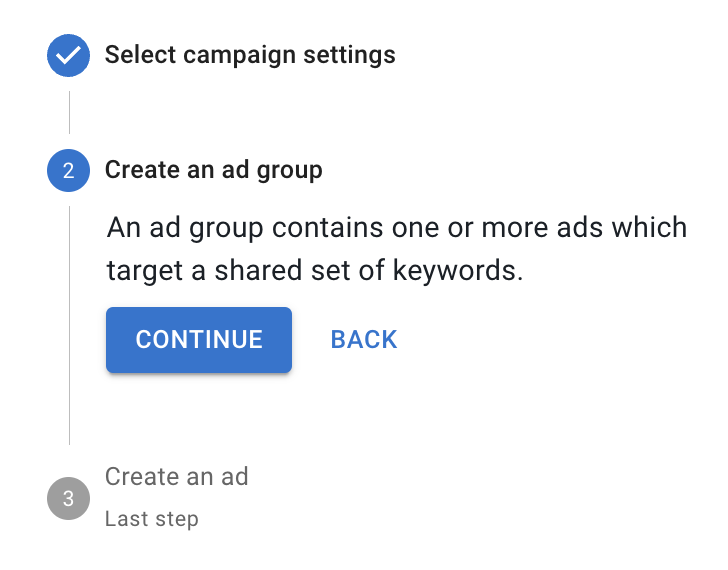
| Component | Step |
Stepper |
Progress Indicator |
| Appearance | 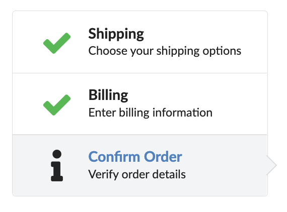 |
 |
 |
| Accessibility Findings | WIZSEUI-1 | WIZMUI-1 WIZMUI-2 WIZMUI-3 WIZMUI-4 | WIZCADE-1 |
| Accessibility Ranking | 3 | 1 | 2 |
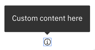
Toggletip
Toggletips use the disclosure pattern to toggle the visibility of a popover.
| Semantic UI | MUI | Carbon Design | |
|---|---|---|---|
| Component | N/A | Tooltip (Triggers) |
Toggletip |
| Appearance | N/A |  |
 |
| Accessibility Findings | N/A | TOGMUI-1 | No issues are observed |
| Accessibility Ranking | N/A | 2 | 1 |
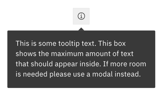
Tooltip
Tooltips display additional information upon hover or focus. The information included should be contextual, helpful, and nonessential while providing that extra ability to communicate and give clarity to a user.
| Semantic UI | MUI | Carbon Design | |
|---|---|---|---|
| Component | Popup |
Tooltip |
Tooltip |
| Appearance |  |
 |
 |
| Accessibility Findings | TOOSEUI-1 | TOOMUI-1 | No issues are observed |
| Accessibility Ranking | 3 | 2 | 1 |
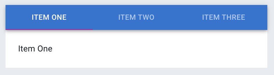
Tab Group
Tabs are used to organize related content. They allow the user to navigate between groups of information that appear within the same context.
| Semantic UI | MUI | Carbon Design | |
|---|---|---|---|
| Component | Tab |
Tabs |
Tabs |
| Appearance | 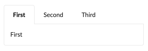 |
 |
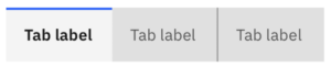 |
| Accessibility Findings | TABSEUI-1 | No issues are observed | No issues are observed |
| Accessibility Ranking | 3 | 1 | 2 |
Finding Details
Input
Semantic UI
INPSEUI-1
A visual label needs to be provided. The HTML5 placeholder attribute in a text input does not replace the label element. Please refer to W3C research about placeholders and labels.
INPSEUI-2
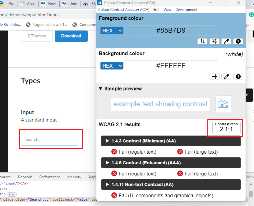
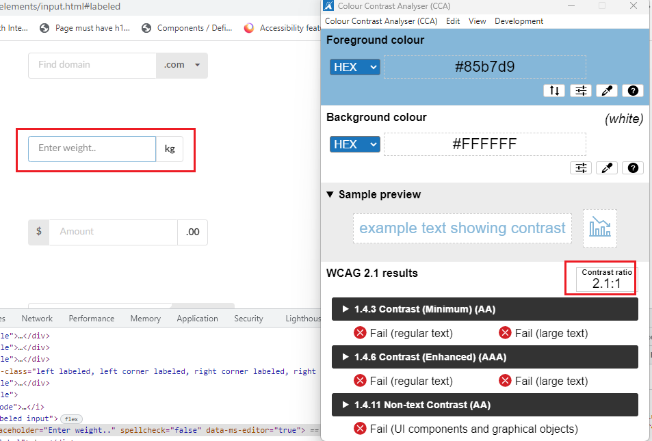
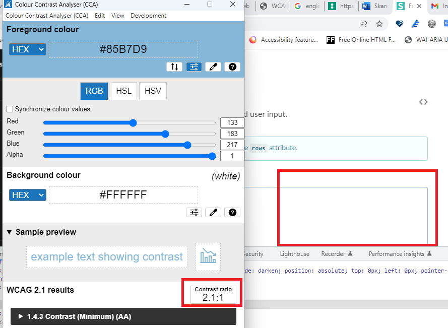
A standard input component keyboard focus border needs to have sufficient color contrast. (Background color: #ffffff, border-color: #85B7D9). The current color contrast is 2.1:1, and the expected contrast ratio is 3:1.
INPSEUI-3
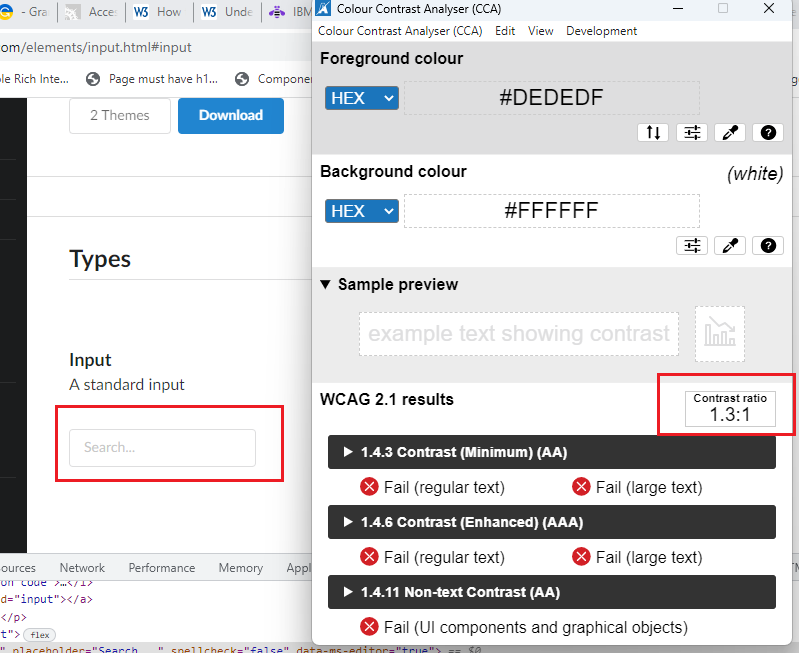
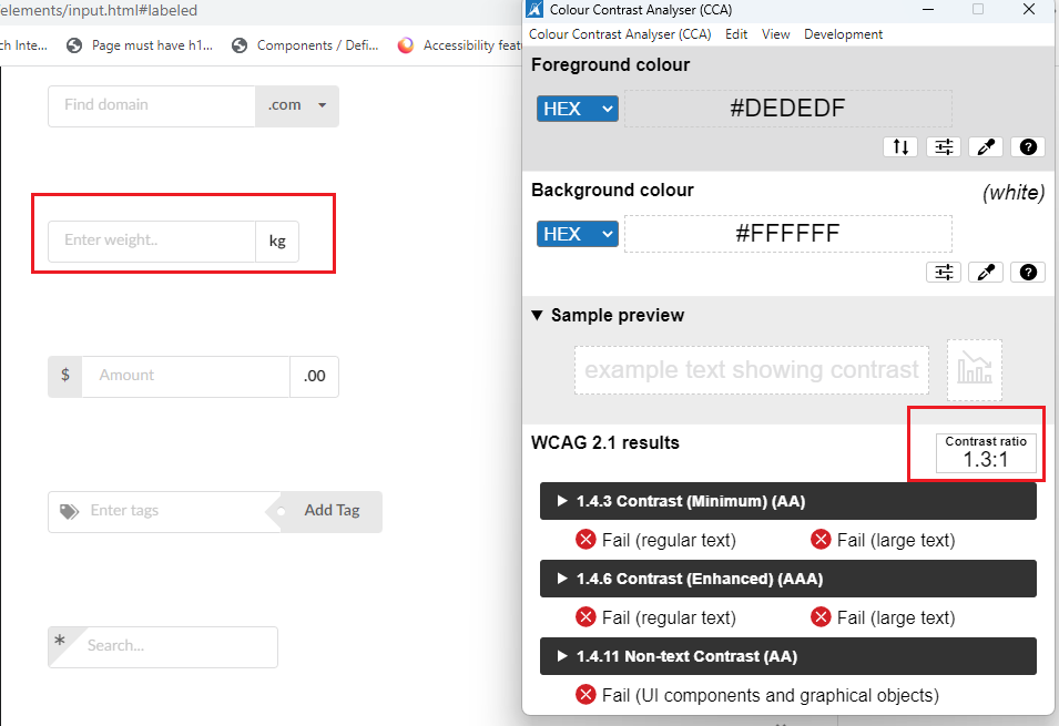
A standard input component border needs to have sufficient color contrast. (Background color: #ffffff, border color: #DEDEDF). The current color contrast is 1.3:1, and the expected contrast ratio is 3:1.
MUI
INPMUI-1
The “Basic TextField” component needs a border. Without a border or a background color, it’s difficult to understand this object is an input field with a single bottom-border alone, especially if the user is not familiar with Material Design/Android look and feel.
Carbon Design
INPCADE-1
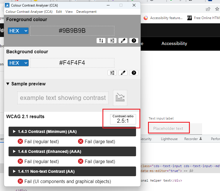
The text input field’s placeholder text needs to have sufficient color contrast. (Background color: #F4F4F4, border-color: #9B9B9B). The current color contrast is 2.5:1, and the expected contrast ratio is 3:1.
INPCADE-2
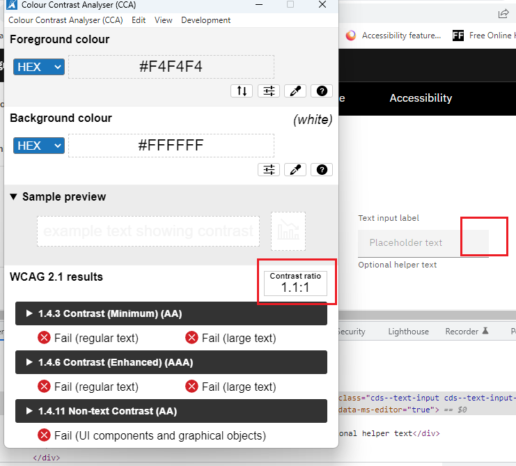
Inside the “Text input,” the background color does not have sufficient color contrast (Foreground color code: #F4F4F4 background color code: #FFFFFF). The current color contrast is 1.1:1, the expected color contrast is 3:1, and the component does not have an all-around border. Therefore, it will negatively impact partially sighted or color-blind users.
Input with accessory
Semantic UI
INPESEUI-1
A visual label needs to be provided. The HTML5 placeholder attribute in a text input does not replace the label element. Please refer to W3C research about placeholders and labels.
INPESEUI-2
The input component keyboard focuses border needs sufficient color contrast. (Background color: #ffffff, border-color: #85B7D9). The current color contrast is 2.1:1, and the expected contrast ratio is 3:1.
INPESEUI-3
The input component border needs to have sufficient color contrast. (Background color: #ffffff, border-color: #DEDEDF). The current color contrast is 1.3:1, and the expected contrast ratio is 3:1.
INPESEUI-4
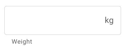
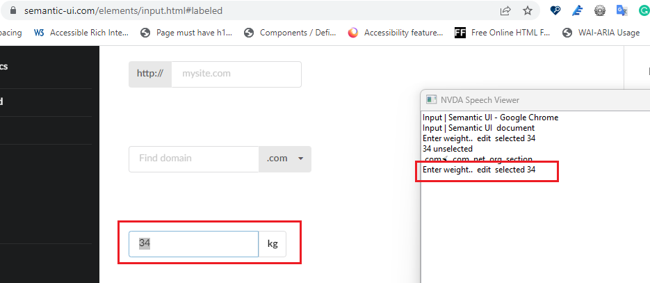
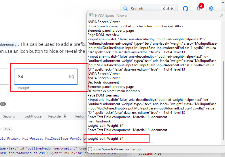
Screen Readers must narrate the base label name and input(Labeled) component label in both focus and form mode. For example, in the screenshot below, when the screen reader lands on the “Enter weight” input(labeled) field, the screen reader narrates, “Enter weight edit selected 34” But the screen reader should narrate, “Enter weight edit selected 34 kg.”
MUI
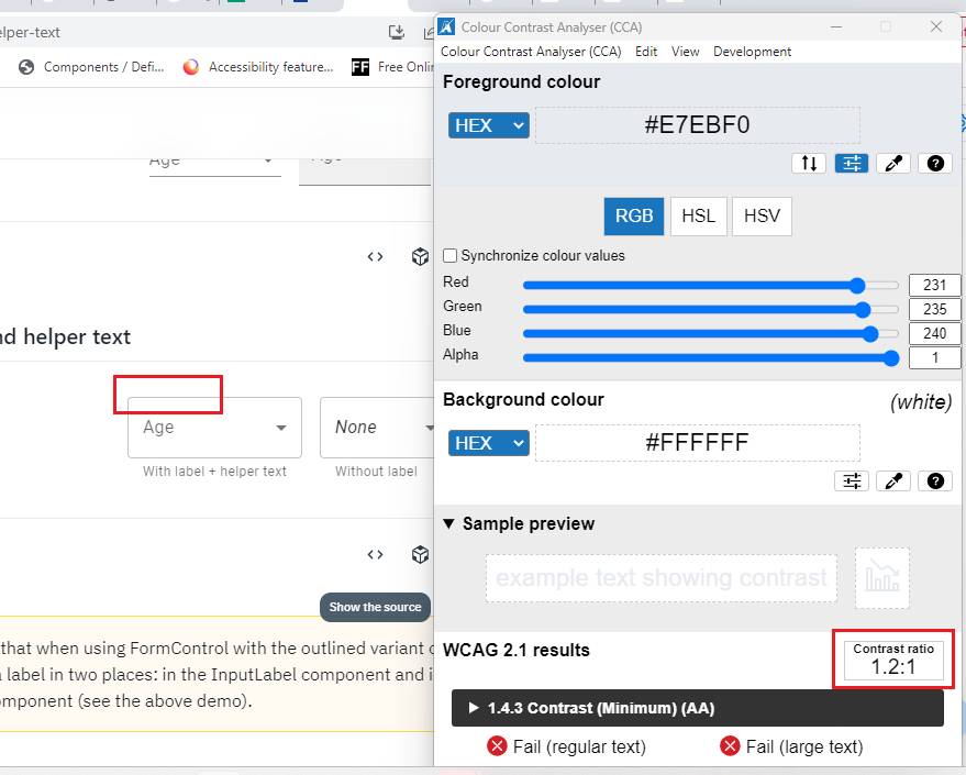
INPEMUI-1
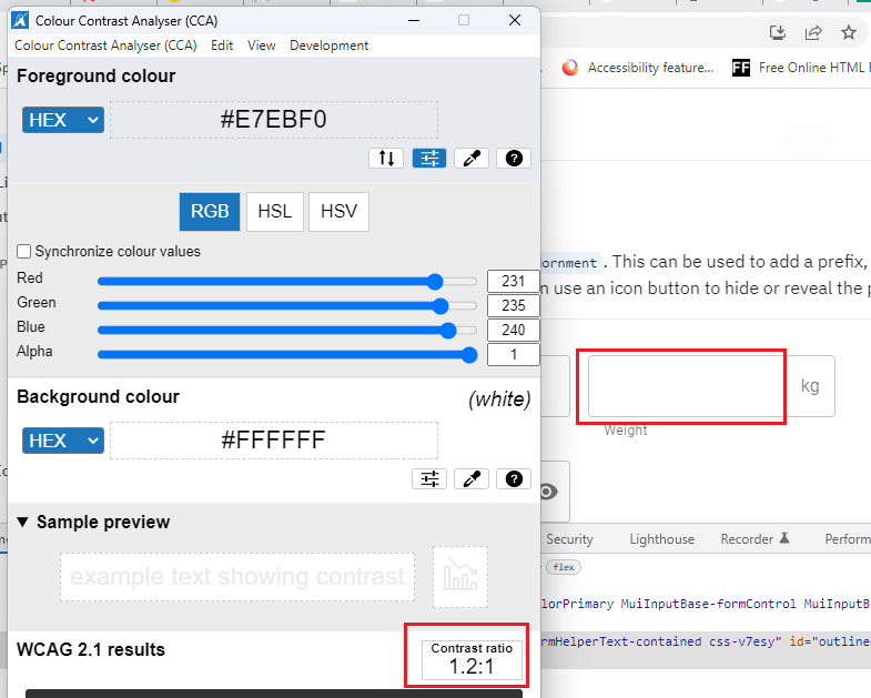
The Input Adornments component border needs to have sufficient color contrast. (Background color: #ffffff, border color: #E7EBF0). The current color contrast is 1.2:1, and the expected contrast ratio is 3:1.
INPEMUI-2
Screen Readers must narrate the base label name and “Input Adornments” component label in focus and form mode. For example, in the screenshot below, when the screen reader lands on the “Weight” Input Adornments field, the screen reader narrates, “Weight edit selected 34,” But the screen reader should narrate, “Weight edit selected 34 kg.”
Textarea
Semantic UI
TEXSEUI-1
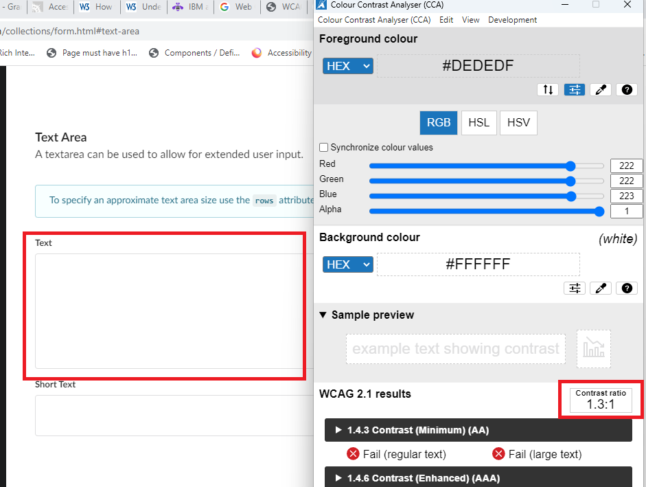
The Text Area component border needs to have sufficient color contrast. (Background color: #ffffff, border-color: #DEDEDF). The current color contrast is 1.3:1, and the expected contrast ratio is 3:1.
TEXSEUI-2
The Text Area component keyboard focus border needs sufficient color contrast. (Background color: #ffffff, border-color: #85B7D9). The current color contrast is 2.1:1, and the expected contrast ratio is 3:1.
TEXSEUI-3
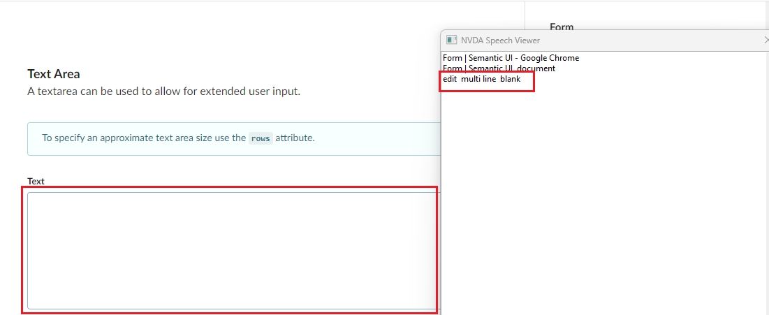
In both focus and form mode, Screen Readers are not narrating the label name when Screen Reader focus lands on the “Text area” component because the label has not programmatically mapped the respective text area component.
MUI
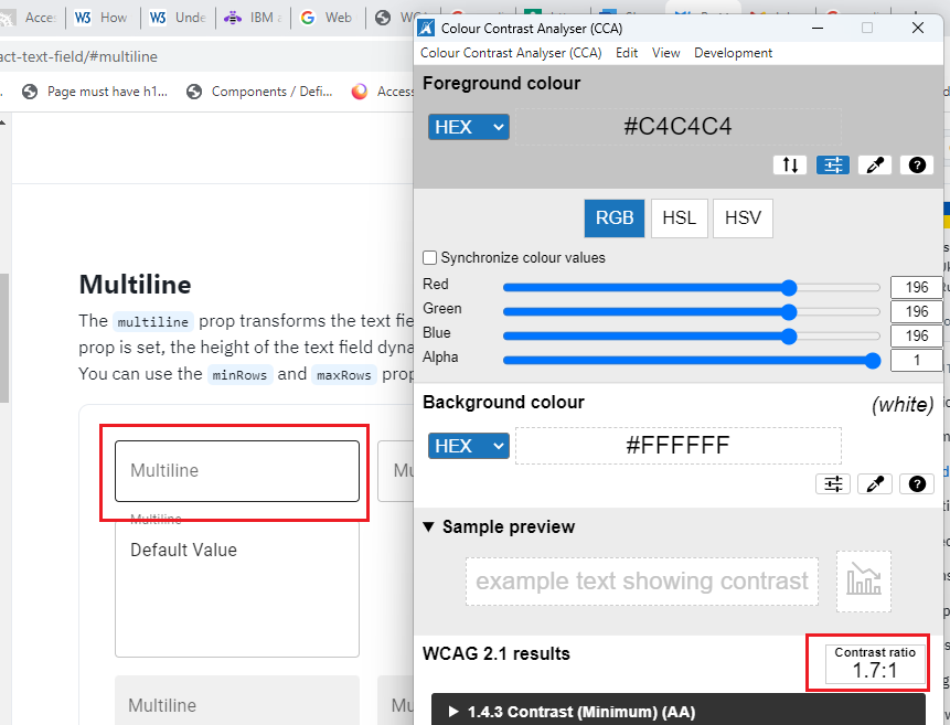
TEXMUI-1
The multiline component border needs to have sufficient color contrast. (Background color: #ffffff, border color: #C4C4C4). The current color contrast is 1.7:1, and the expected contrast ratio is 3:1.
Carbon Design
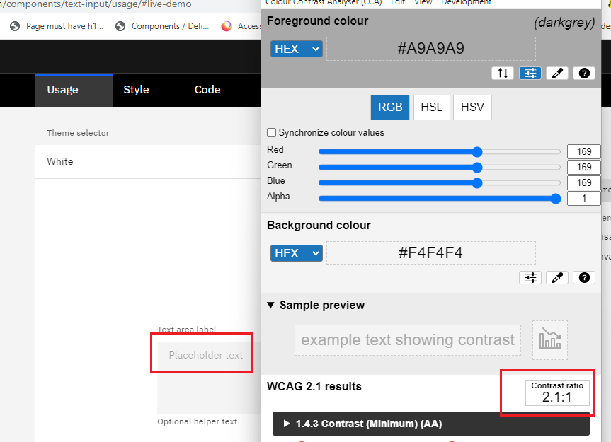
TEXCADE-1
The text area field’s placeholder text needs to have sufficient color contrast. (Background color: #F4F4F4, border-color: #A9A9A). The current color contrast is 2.1:1, and the expected contrast ratio is 3:1.
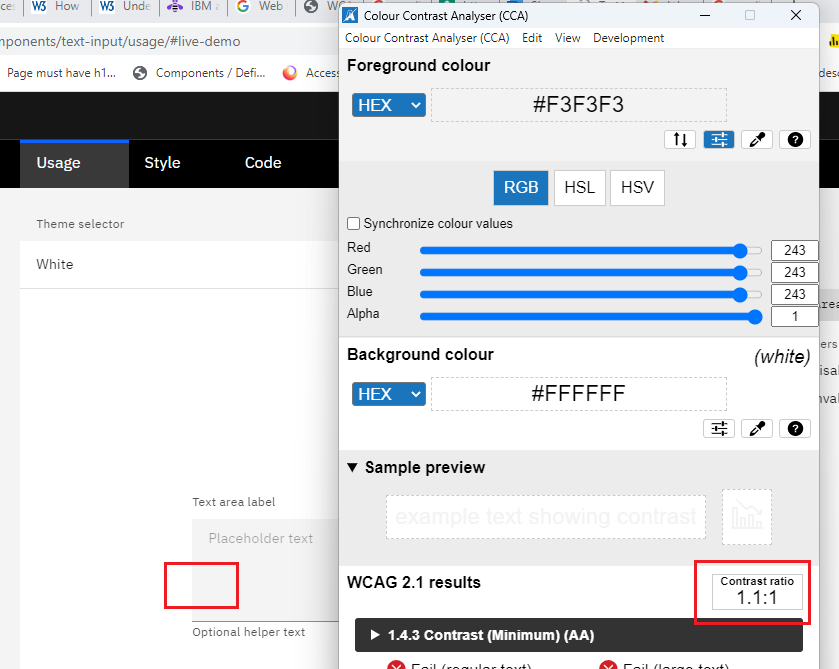
TEXCADE-2
Inside the “Text area,” the background color does not have sufficient color contrast (Foreground color code: #F3F3F3 background color code: #FFFFFF). The current color contrast is 1.1:1, the expected color contrast is 3:1, and the component does not have an all-around border. Therefore, it will negatively impact partially sighted or color-blind users.
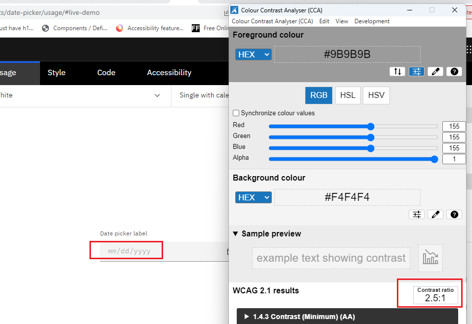
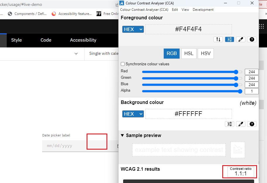
Date Picker
MUI
DATMUI-1
The Date Picker component border needs to have sufficient color contrast. (Background color: #ffffff, border-color: #C4C4C4). The current color contrast is 1.7:1, and the expected contrast ratio is 3:1.
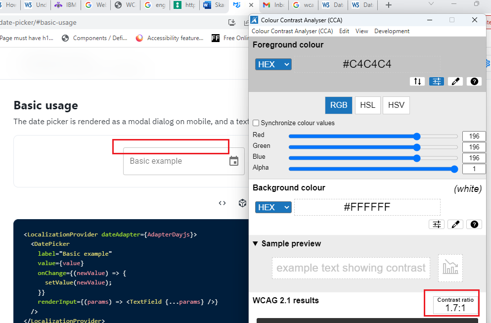
Carbon Design
DATCADE-1
The Date Picker component border needs to have sufficient color contrast. (Background color: #F4F4F4, foreground color: #9B9B9B). The current color contrast is 2.5:1, and the expected contrast ratio is 3:1.
DATCADE-2
Inside the “Date picker label field,” the background color does not have sufficient color contrast (Foreground color code: #F4F4F4 background color code: #FFFFFF). The current color contrast is 1.1:1, the expected color contrast is 3:1, and the component does not have an all-around border. Therefore, it will negatively impact partially sighted or color-blind users.
DATCADE-3
In the Date Picker component, shortcut keys are not working. Please refer to the WCAG date picker shortcut key access example.
Dropdown
Semantic UI
DROSEUI-1
The Dropdown component border needs to have sufficient color contrast. (Background color: #ffffff, border color: #B2B2B2). The current color contrast is 2.1:1, and the expected contrast ratio is 3:1
MUI
DROMUI-1
Screen readers must narrate the options list in both scan and focus mode.
DROMUI-2
Screen readers must narrate the list count and position state (Selected) in both scan and focus mode.
DROMUI-3
Screen readers are not narrating the Helper text when the screen reader focus lands on the “Select” component.
DROMUI-4
The Select component border needs to have sufficient color contrast. (Background color: #ffffff, border color: #E7EBF0). The current color contrast is 1.2:1, and the expected contrast ratio is 3:1.
Carbon Design
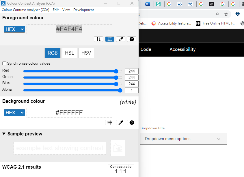
DROCADE-1
Inside the “Dropdown,” the background color does not have sufficient color contrast (Foreground color code: #F4F4F4 background color code: #FFFFFF). The current color contrast is 1.1:1, the expected color contrast is 3:1, and the component does not have an all-around border. Therefore, it will negatively impact partially sighted or color-blind users.
Slider
MUI
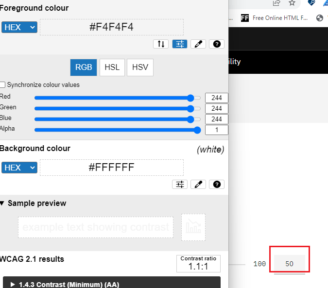
SLIMUI-1
Visual label not provided for slider component. Visible labels to identify all form controls. In most cases, this is done by using the <label> element.
Carbon Design
SLICADE-1
Inside the “Slider,” the background color does not have sufficient color contrast (Foreground color code: #F4F4F4 background color code: #FFFFFF). The current color contrast is 1.1:1, the expected color contrast is 3:1, and the component does not have an all-around border. Therefore, it will negatively impact partially sighted or color-blind users.
Radio Group
Semantic UI
RADSEUI-1
The “Radio Checkbox” component’s legend is not defined programmatically in the legend tag. As a result, screen readers are not able to narrate the legend when the screen reader focus lands on the radio button.
RADSEUI-2
Screen readers are not narrating the “Radio Checkbox” component’s label information in scan and focus mode.
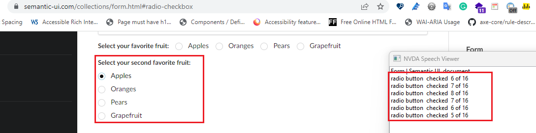
RADSEUI-3
Screen readers narrate the invalid radio button count in the “Radio Checkbox” component.
Checkbox Group
MUI
CHEMUI-1
Screen readers are not narrating the element’s help text when the screen reader focus lands on the first checkbox. The execrated behaviour is when the screen reader lands on the first check box, it should narrate the legend, label name, and help text along with the checkbox role and state.
Button
Semantic UI
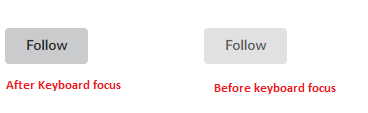
BUTSEUI-1
Very weak way to display focus. Color change is almost non-noticable and there is no border.
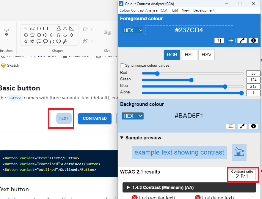
MUI
BUTMUI-1
The “Button” component keyboard focus needs to have sufficient color contrast. (Background color: #BAD6F1, foreground color: #237CD4). The current color contrast is 2.8:1, and the expected contrast ratio is 3:1.
Button with icon
Semantic UI
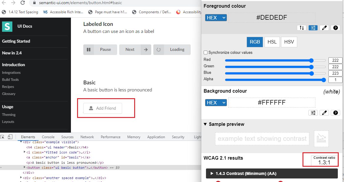
BUTISEUI-1
The ” Button basic” component border needs to have sufficient color contrast. (Background color: #FFFFF, foreground color: #DEDEDF). The current color contrast is 1.3:1, and the expected contrast ratio is 3:1.
MUI
BUTIMUI-1
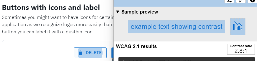
The ” Buttons with icons and label” component keyboard focus needs to have sufficient color contrast. (Background color: #BAD6F1, foreground color: #237CD4). The current color contrast is 2.8:1, and the expected contrast ratio is 3:1.
File uploader
Carbon Design
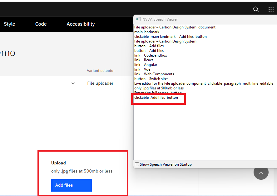
FILCADE-1
Screen readers are not narrating the help text or descriptive file format information.
Modal
Semantic UI
MODSEUI-1
After activating the “Modal” component keyboard focus moves to background elements.
MODSEUI-2
Screen readers are not narrating the “Modal” component information.
MODSEUI-3
Headings are not defined programmatically in the side modal window component. As a result, screen readers are not narrating the Modal component heading information.
MUI
MODMUI-1
Screen readers are not narrating the “Modal” dialog information when the modal component is opened.
Accordion
Semantic UI
ACCSEUI-1
By using the keyboard unable to access and navigate the “Accordion” component. Please refer WCAG example in given link https://www.w3.org/WAI/ARIA/apg/example-index/accordion/accordion
MUI
ACCMUI-1
A keyboard focus border should be required, along with a color change for a better focus keyboard indicator.
Chip
Semantic UI
CHISEUI-1
Alternative texts are not provided for icons. Alt attributes enable screen readers to read the information about on-page images/icons for the benefit of a person with a complete lack of sight, who is visually impaired, or who is otherwise unable to view the images on the page. Currently, screen readers are narrating “23”. And The expected screen reader narration is “Email 23”.
MUI
CHIMUI-1
Provide the descriptive <title> text to describe the SVG image purpose. Here, <title> tag enables screen readers to read the information about on-page images/icons for the benefit of a person with a complete lack of sight, who is visually impaired, or who is otherwise unable to view the images on the page.
Wizard
Semantic UI
WIZSEUI-1
“Step” component items are not defined in the list. As a result, users relying on screen readers cannot identify the wizard items count in scan mode. Please refer WCAG example https://www.w3.org/WAI/tutorials/forms/multi-page/
MUI
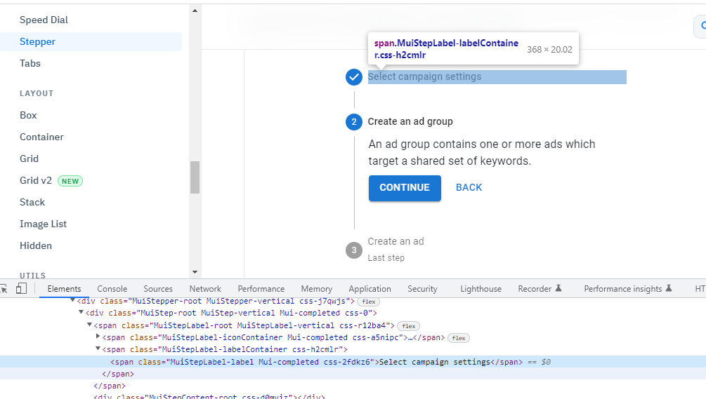
WIZMUI-1
“Stepper” component items are not defined in the list. As a result, users relying on screen readers cannot identify the wizard items count in scan mode. Please refer WCAG example https://www.w3.org/WAI/tutorials/forms/multi-page/
WIZMUI-2
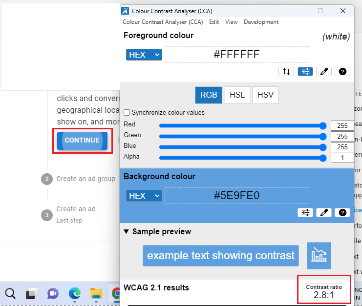
The “Stepper” component keyboard focuses border needs sufficient color contrast. (Background color: #5E9FE0, Foreground color: #FFFFFF). The current color contrast is 2.8:1, and the expected contrast ratio is 3:1.
WIZMUI-3
The keyboard focus order is not logical after activating the “Back” button. After pressing the “Back” button, the keyboard focus moves to the next element instead of the Previous step’s interactive element.
WIZMUI-4
In the “Stepper” component step section, headings are not defined in the heading tag. As a result, users relying on screen readers will have difficulty understanding the content structure.
Carbon Design
WIZCADE-1
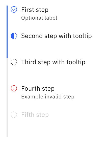
Unconventional icons conveying the status of each step, in progress, invalid, completed etc. Changing icons is difficult.
Toggletip
MUI
TOGMUI-1
The screen reader narrates the help text immediately when the screen reader focus lands on the “Tooltip (Triggers)” component. However, after activating the “Tooltips (Triggers)” component, the screen reader is not narrating any information.
Tooltip
Semantic UI
TOOSEUI-1
By using the keyboard unable to access/navigate the “Popup” component. Screen readers do not narrate the element’s name and role.
MUI
TOOMUI-1
The screen reader narrates the help text immediately when the screen reader focus lands on the “Tooltip” component. However, after activating the “Tooltips” component, the screen reader is not narrating any information.
Ready to make your digital experience accessible to everyone?
Take the first step toward a more accessible digital presence. With AI-powered scanning across web, documents, and mobile apps, human-led auditing, guided remediation tailored to your tech stack, and a global network of accessibility experts, Accessibility Cloud gives you everything you need in one platform.
Want to join the community?
Find us on Discord